By default, all charts in Google Data Studio are connected to a single data source. However, as part of Data Studio’s data blending capabilities, you can create charts based on multiple data sources. For example, you can blend two different Google Analytics 4 (GA4) properties to measure the performance of your app and website in a single visualization. I know that there are a lot of articles out there covering data joining and blending, but I wanted to create something that is relevant specifically for Google Data Studio and for 2021.
In this post, we will look at data blending in Google Data Studio (the 2021 Edition) and see how the functionality has evolved over the years. When Data Studio first became available, data blending was not its strongest suit, but things have changed for the better. Let’s see how.
What is Data Blending?
Data blending is the process of merging data from multiple sources to create one new dataset that can be processed, analyzed, or presented in a visualization tool such as Google Data Studio.
Large agencies and other businesses get data from many sources, and sometimes they want to bring this data together temporarily to answer a specific question or compare data relationships. Data blending tools help unify data from web analytics, spreadsheets, cloud applications, and business systems, among others.
In the past (a painful experience for the analysts out there), individuals and businesses that needed to compare data from different sources had to export each raw file from the respective source platform and then combine it in Google Sheets or Excel. Every time they needed to compare newer data, they had to start the process all over again.
Not ideal…
Steps for Data Blending
Whether you are using Google Data Studio or another tool, the core steps for data blending are mostly the same.
1. Data Acquisition

The first step in data blending is data collection. You need to collect data from various cloud and non-cloud databases, social media tracking apps, cloud, and spreadsheets.
2. Joining Data

After getting all the necessary data, now it’s time to join it together. Here is where you will use the data blending functionality in Google Data Studio.
3. Data Cleaning

You can clean and refine your data by removing incorrect and incomplete information. Then modify the remaining data, so it’s properly optimized and formatted for an accurate analysis.
Get the Keys
Nope, not the door ones. The keys are super important when it comes to data blending. Your data sources need to share a common aspect. This acts as the join key. For example, it can be a user id, product name, or page URL, among many others.
The date is the most used join key because it’s very simple to compare two things over time. Besides, date helps you to spot correlations in datasets easily. However, choosing the join key depends on the data that you want to compare. The first thing you need to do is form a hypothesis to help you match the sources.
UPDATE: As of February 17, 2022, Google Data Studio has added the remaining data blending options. You can read more about them in our article on Advanced Data Blending in Google Data Studio.
It is also important to note, that Google Data Studio supports only the LEFT (OUTER) JOIN. In other words, in a LEFT (OUTER) JOIN of Table 1 and Table 2, the result is all the records of Data Source 1 and those records in Data Source 2 that share the same key values. Here is a quick illustration.

Why is data blending important?
Rapid Results. Non-technical users can get rapid results in key areas such as finance, sales, and marketing. For example, marketers can blend data from a spreadsheet with the profitability of a product and CRM software. Then they can easily view the products that attract most customers purchasing interest besides the ones that make the most money.
Data-Driven Decision Making. Senior management can make data-driven decisions faster using the data blending tools. This will contribute to more sales and profits because it lets them focus on products that customers like.
How to use Google Data Studio for Data Blending?
Let’s look at two ways that you can blend data using Google Data Studio.
Method 1 (Quick and Dirty)
This is a super fast and visual way to blend data. If two charts share a common joint key, then Google Data Studio will combine them into one automatically.
Time Needed : 1 minutes
You can blend data without writing a lone of code or completing any complex setups.
Create two different charts and select them.
You can start with two different tables. Hold “Ctrl” when clicking on each chart.
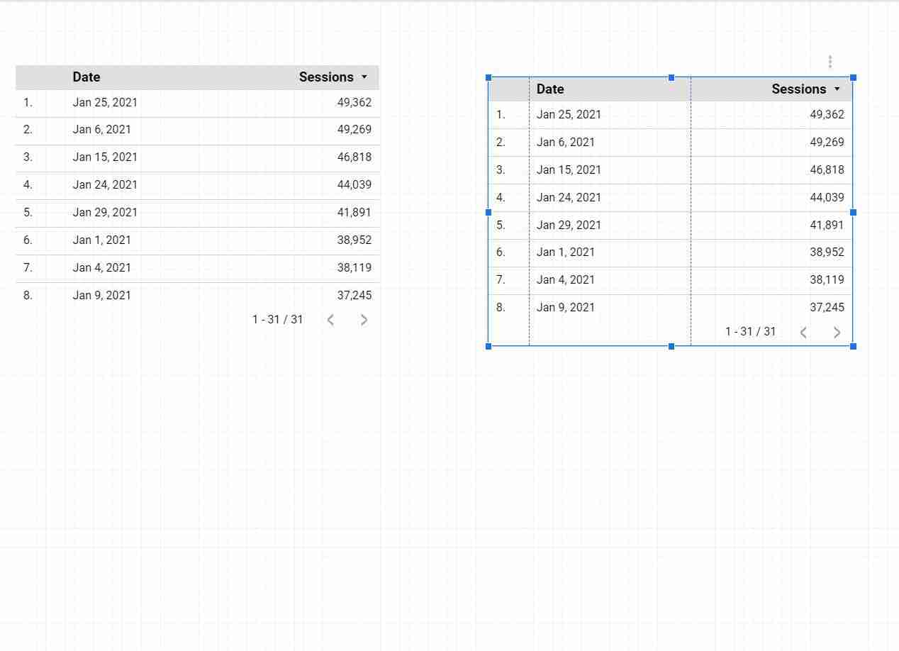
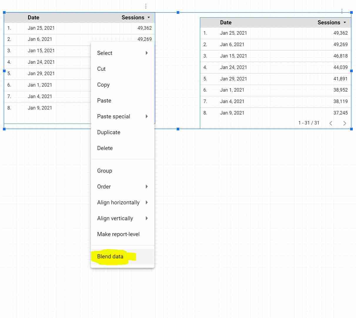
Right-click and choose “Blend Data”
If the two charts share a common joint key, then Google Data Studio will combine them into one automatically.
Tools
- All of this can be done directly in the Google Data Studio report interface.
Materials
- Note that when you right-click and the “blend data” data option doesn’t show up, then your charts are “unblendable”.
Method 2 (More Complex)
This method involves more steps, but it gives you more control. In summary, these are the key steps, which we will explore with an example later on:
- Click “Resource”, then “Manage Blended Data”.
- Click “Add a Data View”.
- Select the data you wish to compare in the pop-up.
- Click on “Add Another Data Source”.
- Select a join key in both sources.
- Choose the dimensions you want to compare.
- Optimize your settings and click “Save”.
- You can view your blended data by clicking on the data source.
You can start with the first method for one-dimensional blends before trying the second one.
How does blending data sources with multiple dimensions as join keys work?
I have created two spreadsheets with sample data for this exercise. Of course, you can use any data source connectors available on Google Data Studio. Follow these steps to blend your data.
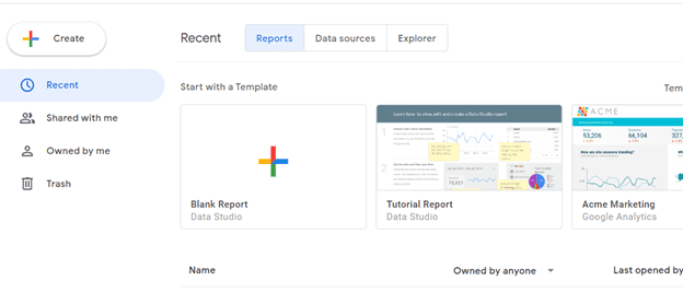
Step 1: Open Google Data Studio and click on “Blank Report”.
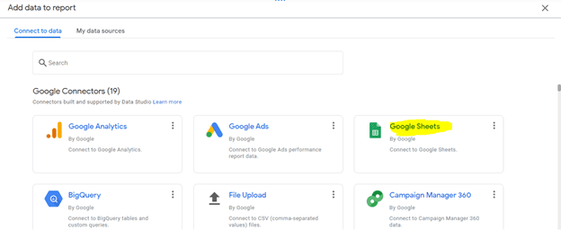
Step 2: Choose the data source that you want to blend. We will choose Google Sheets for this example.
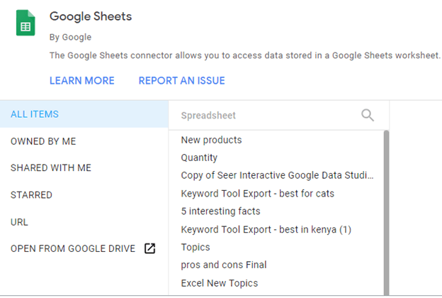
Step 3: Now, select your data from the list. Use the panel to navigate and find your file.
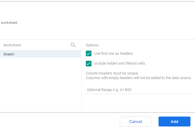
Step 4: Read the prompts first before adding the file. In this case, we will use the first row as the headers, so we’ll make sure the option is ticked.
Other data connectors may have different options to make sure that you have ticked appropriately.
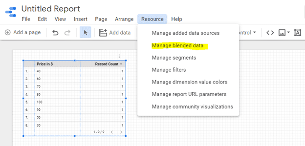
Step 5: Your data will be loaded on a new page. Now click on the “Resource” button on the top, and select “Manage Blended Data”.
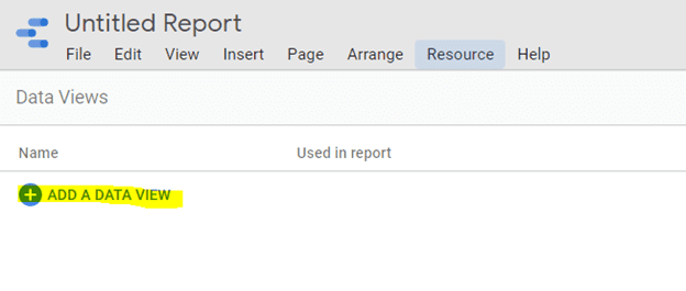
Step 6: A new window will appear, where you can add a new data blend. Click the “Add a Data View” blend button.
Step 7: A new page will load to add a new file or data from the same file to blend. You can add many data sources to initiate the blending. But in this example, we will only use two because we have two Google Sheets.
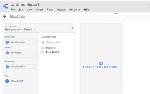
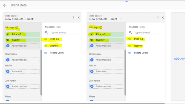
Step 8: You need to set up the metrics and dimensions for your data to blend automatically. But first, you need to select the “Join Keys” if Google has not selected them automatically. Simply drag and drop the join keys.
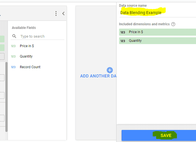
Step 9: Rename your blended data. Review your inputs once more before saving. Click the blue-button on the bottom right corner to save your work. And that’s it, and you have created your first data blend.
Optional: You can create a calculated field in the data blending configuration.
Creating calculated fields on a blended data source can be convenient when configuring join keys if the columns in your data sources aren’t perfectly compatible
Challenges of Data Blending in Google Data Studio
This section is based on feedback from the community and includes questions that I have encountered in the workplace.
What is the difference between data blending and data Joining?
Data blending merges data from different sources, whilst data joining uses data from the same source only.
How many sources can you blend in Google Data Studio?
Google Data Studio allows you to blend up to 5 data sources in one chart. That being said, if you are using a LIVE connector, the loading time of your report can be fairly high.
Can I use data blends across reports?
Unfortunately, blended data sources belong to the report in which they were created. Also, you cannot reference the calculated fields you create in other calculated fields in the same blended data source.
Final Thoughts
Data Blending is one of the most underrated techniques when it comes to data automation. If you pay close attention to it, you can unlock some valuable insights and save yourself a lot of manual work. It can make work easy for both new and advanced analysts when identifying sales patterns or data trends. Besides, it helps senior management to make decisions faster based on real-time data that combines multiple data sources. Although there are many platforms with data blending capabilities, Data Studio stands out to be one of the best, because it’s free, easy to use, and is constantly evolving.
I hope this was helpful! If you have any questions, feel free to DM me on LinkedIn or subscribe to my newsletter for more updates ?
Dynamic Dashboards and Data Analysis with Google Data Studio
If you want to learn how to build powerful data visualizations and unlock insights that can help you drive business results for your clients or employers, take a look at my full course on Udemy.

3 comments
Images are missing 🙁
Hey Shelley, I just checked once again and updated the page. All images should be there 🙂
Thanks for great content Lachezar! I have a doubt which you may have experienced before. I have dimension: Event Action and metric: Sessions. All I want is to create a barchart but also having the ‘All’ event action categories as a separate category. Simply I want to display the grand total on table charts as a separate column in barchart. I tried using blends but couldn’t achieved to get this. Thanks in advance!
Comments are closed.