How to extract a report theme from an image in Google Data Studio?

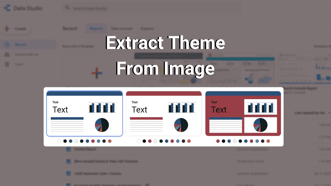
In this post, I want to show you how to extract a theme from an image in Google Data Studio. We often find ourselves in situations, where the dashboard look-and-feel needs to align with the client’s brand and style. However, imagine that you have already built a dashboard and you have to now go and change the colour and font of every single table, chart and label. It takes a lot of time if you do it manually, so here is a nifty time-saver tip.
Time Needed : 2 minutes
Extract a theme from an existing, uploaded or web-based image
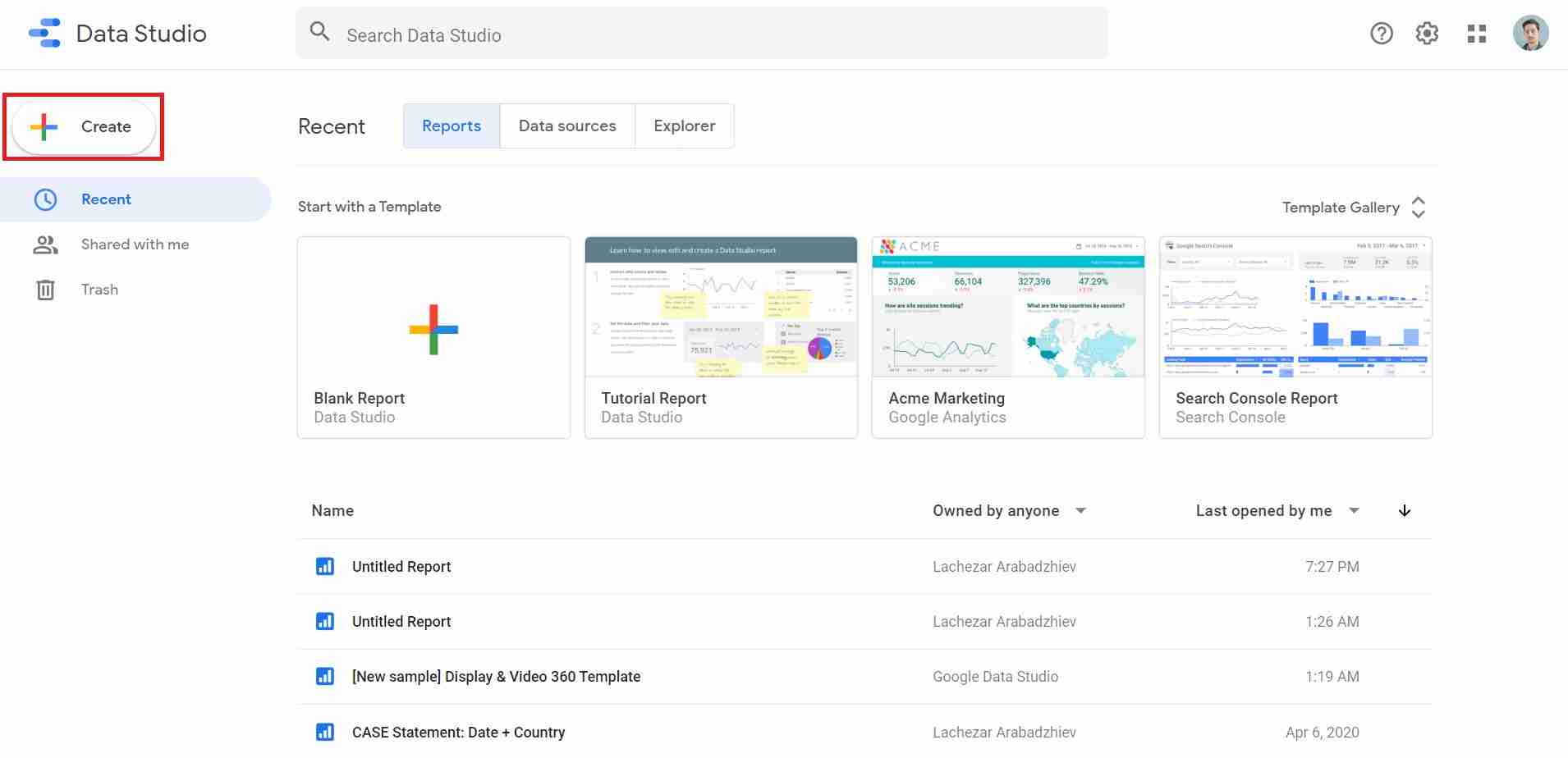
Go to Google Data Studio and “Create” a new report.
You can use an existing report as well.

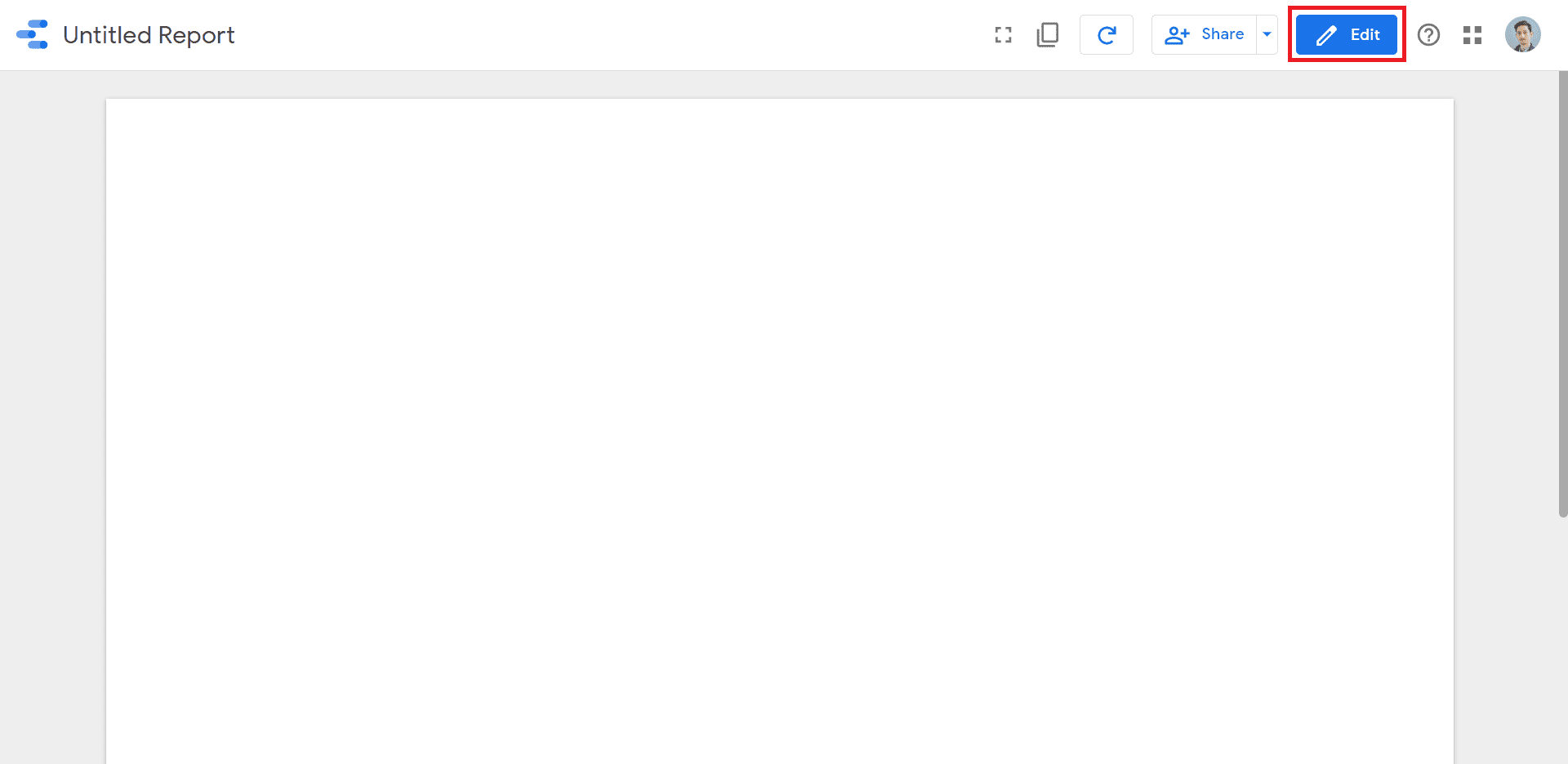
Click on the “Edit” button of your report.
Make sure you do not select any chart or table by clicking in the grey area outside the report.

Choose one of the “Extract theme from image” options. All of them will lead to the same outcome:
3.1 Right-click an existing image in your report.
3.2 Pick “Upload from computer” and select a locally stored image.
3.3 Paste the URL of an image available on the web.In a pop-up window, Data Studio is going to suggest “Themes created for you”, using different colour schemas.
In this case, Data Studio has identified the predominant colours in my image.
Once you pick a theme, the configuration is going to be available under “Theme and Layout”.
You can also edit the newly generated theme further by selecting “Customize”.
Tools
- This feature is directly available in Google Data Studio.
Materials
- Remember, all you need as a source for the theme is a random image.
I hope this was a helpful design trick in! If you have any questions, feel free to DM me on LinkedIn or subscribe to my newsletter.
Dynamic Dashboards and Data Analysis with Google Data Studio
Learn how to build powerful data visualizations and unlock insights with my course on Udemy. If you are wondering, these are the things you will gain knowledge about. Take a look.
By the end of the course, you will be able to:
- Use and understand all chart types throughout the course (Bullets, Pie Charts, Scorecards, Scatter plot and etc.).
- Connect and blend data sources from Google Analytics and Google Sheets.
- Create custom dimensions with conditional expressions (CASE + REGEXP_MATCH + IN).
- Build a user journey funnel with Google Analytics data based on a “Page Title” dimension.
- Explore user-level data with scatter plot (eCommerece) and create a device breakdown visualization.
- Build a time-series chart with rolling dates and interaction filters.
- Automate reports with advanced date selection filters.
- Understand the access levels in Data Studio “Owner” vs “Viewer”.
- Apply conditional formatting rules to signal data anomalies.
- Apply IF statements within a CASE and use operators.
- Extract a report theme and colour scheme from an image in Data Studio.
Recent Posts
AI Video Creation with Runway, Sora & ChatGPT
I've dedicated a considerable amount of time to exploring AI tools like ChatGPT, Microsoft Copilot,…
How to Use AI to Enhance Your Content Creation Process
Businesses and individuals everywhere are rethinking their content strategies thanks to the rapid advancement of…
Top Generative AI Tools for Content Strategy
I am sharing these links for all the learners, who are part of my new…
The Ultimate Guide to Building Apps with AI Prompts in Lovable
Developing an app idea can be cumbersome, especially for those without a coding background. From…
How to Boosting Business Productivity with Google Gemini
Yep, I know that by this point, you have probably tried Google's Gemini and experimented…
Streamline Everyday Work Tasks with Microsoft Copilot
After covering ChatGPT and testing Zapier AI Actions, I thought I will explore Microsoft Copilot…
