In this post, I want to show you how to use the slider control in Google Data Studio to filter metric values. Now, this sounds like one of those tiny time-saver features, but the slider control is actually critical for complex dashboards. For example, in the past, you could add a metric as a filter, but then you would have to click on each distinct value to filter for it. This was not exactly the greatest user experience, especially if you have sales data. As a result, Google has introduced the “metric sliders”, which is a dynamic filtering option embedded in each chart. Let’s see how this thing works!
Also, if you want to follow the steps closely, I am using a public dataset called “[Sample] Google Analytics Data”. The dataset is available in all Data Studio accounts.
Time Needed : 3 minutes
For dashboard/report viewers, here is how to use a metric slider to filter a chart by a specific metric value.
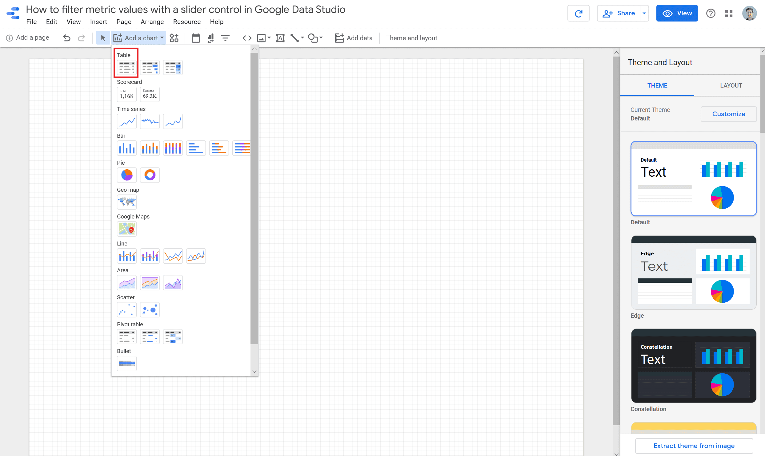
Open a new report in Google Data Studio and add a "Table" chart type.
You can use an existing report if you want to follow with your own data.
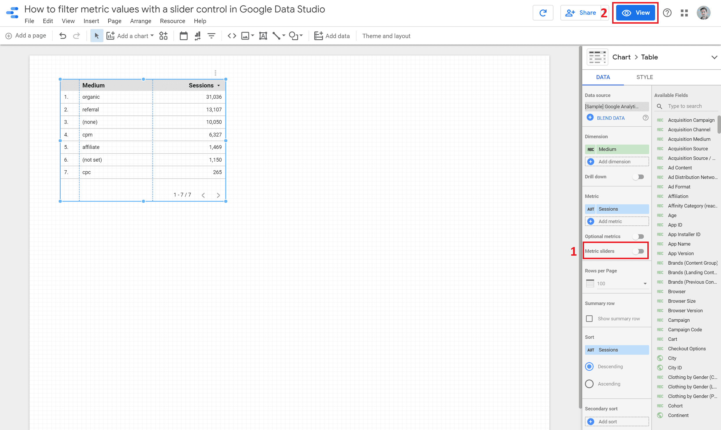
Toggle the "Metric sliders" button and then click on the "View" button
2.1 Once you enable the “Metric sliders”, you would notice that the “Optional metrics” would disappear; you can only have one at a time. 2.2 Also, in order to interact with the slider, you would have to switch to “View ” mode.
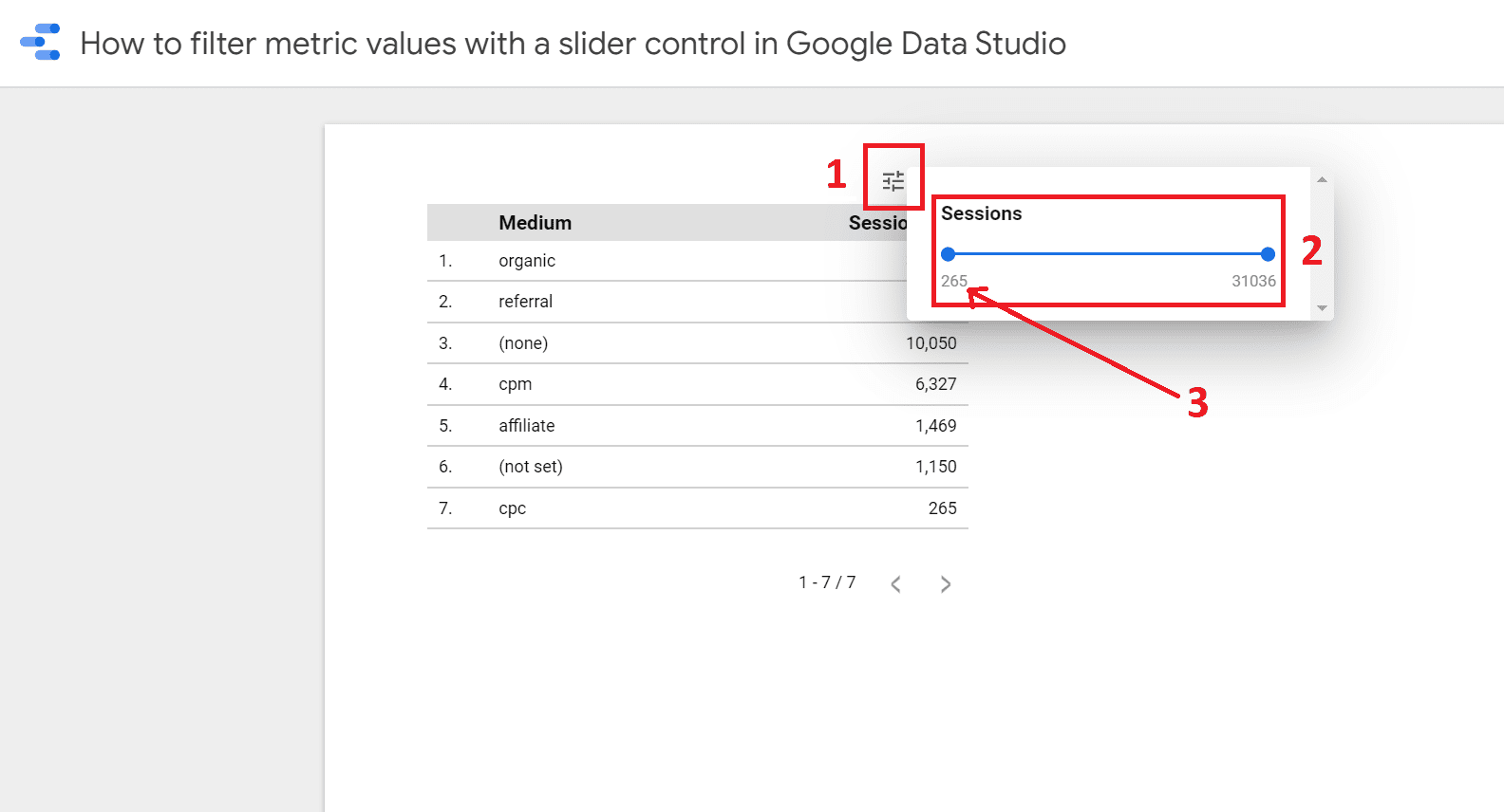
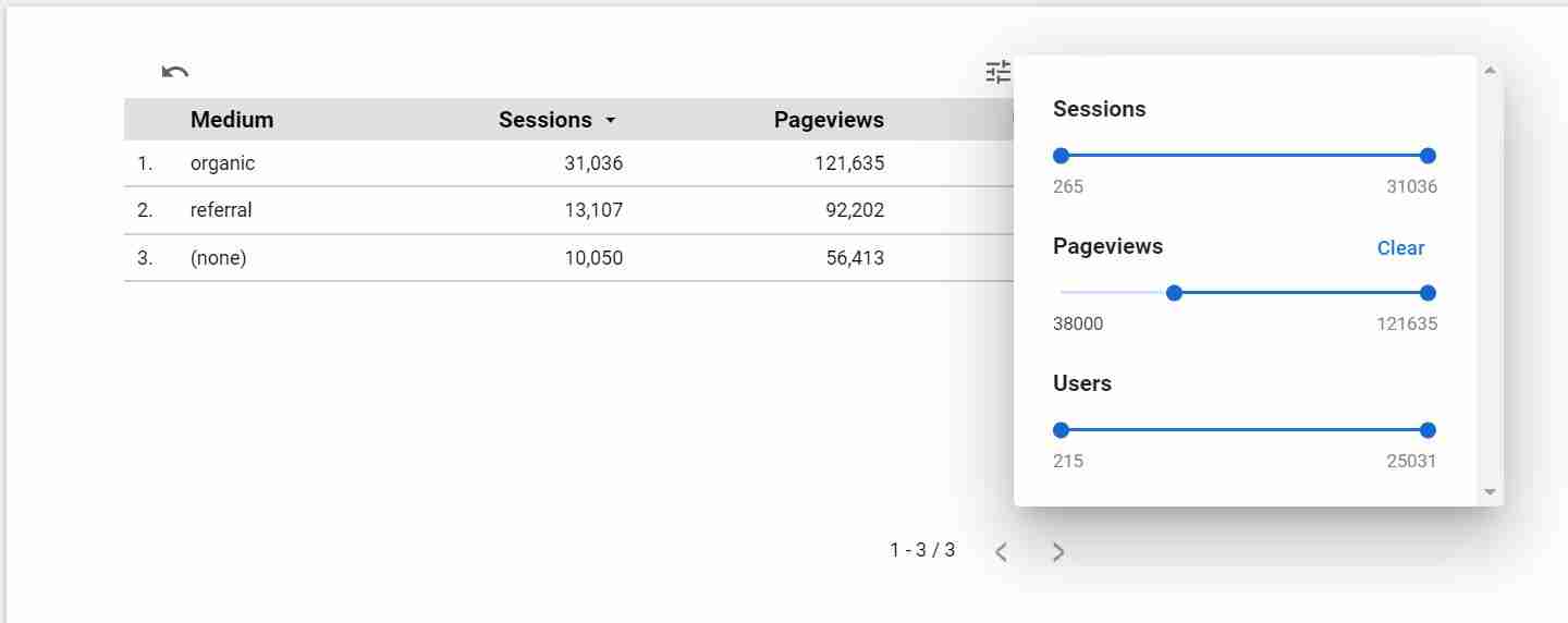
Hover over the chart and click on the filter icon to open the "Metric sliders"
3.1 You can drag the ends of the slider to adjust the range of the values you want to filter for.3.2 If you want to set the upper and lower bounds to specific values, you can click on each number and type the values right away.
Optional: Edit the chart once more and add multiple metrics to the slider
You can always add addition metrics to the chart and the slider will auto-update. It is also important to know that if you filter by one metric, this would not affect the other metrics in the chart.
Tools
- Most charts have the “metric sliders” option easily accessible, excluding pivot , scatter and bullet charts. Also, don’t forget, a chart can have “metric sliders” or “optional metrics”, but not both. Therefore, choose wisely based on the outcome you want to achieve.
Materials
- As of June 18, 2020, the “metric sliders” feature is available in Google Data Studio.
I hope this was a helpful trick to filter a metric in Google Data Studio! If you have any questions, feel free to DM me on LinkedIn or subscribe to my newsletter.
Dynamic Dashboards and Data Analysis with Google Data Studio
If you want to learn more about building complex dashboards, take a look at my full course on Udemy. The course has a dedicated section on advanced design and ways to make your dashboards more intuitive.

2 comments
It is good to see so many options which were hiding in settings. Thanks for explaining them clearly.
Great to see that this was helpful Nischal! 🙂