Within your dashboards and reports, it is important to highlight the key data points, so that the people using your reports can construct an insight faster and in a more clear way. This is why when conditional formatting was added to Data Studio, everyone was super excited. In this post, I am sharing a video from my Data Studio course that goes over using conditional formatting effectively and exploring rule sequencing.
Video Transcript for Conditional Formatting (modified for clarity):
Let’s take a look at conditional formatting. What I’ve done here is, I’ve just created a brand new report, so we have a clean space. We’re going to create just a simple grid and click on tables. We are going to create a brand new table here. We’re going to do a couple of changes on the table so we’re using the data source as Google Analytics data once again.
That’s the sample, it’s available across all Google Data Studio accounts. For dimension, we’re going to use a Google Analytics dimension called page. Page is simply the URL in your website. Click on that. We’ll keep the sessions and for the style I’m just going to go ahead and remove the first column.
The row numbers. Now we have the table expanded a little bit and we’re also going to add a filter for a date range. We’re going to deal with a specific subset of data and that’s going to be January 1st to January 31st. So, we’re just going to go back. Pick that.
We’re going to work on just this fixed date range, right, then click apply. Great. So, we have that. We’re going to click on the table and go in the style tab here and there you have it, conditional formatting. So the way conditional formatting works is, you can give specific rules for the data and you can colour or alter the font of the data to highlight a specific range or a ratio. So, we’re going to start with creating our first rule.
Continued…
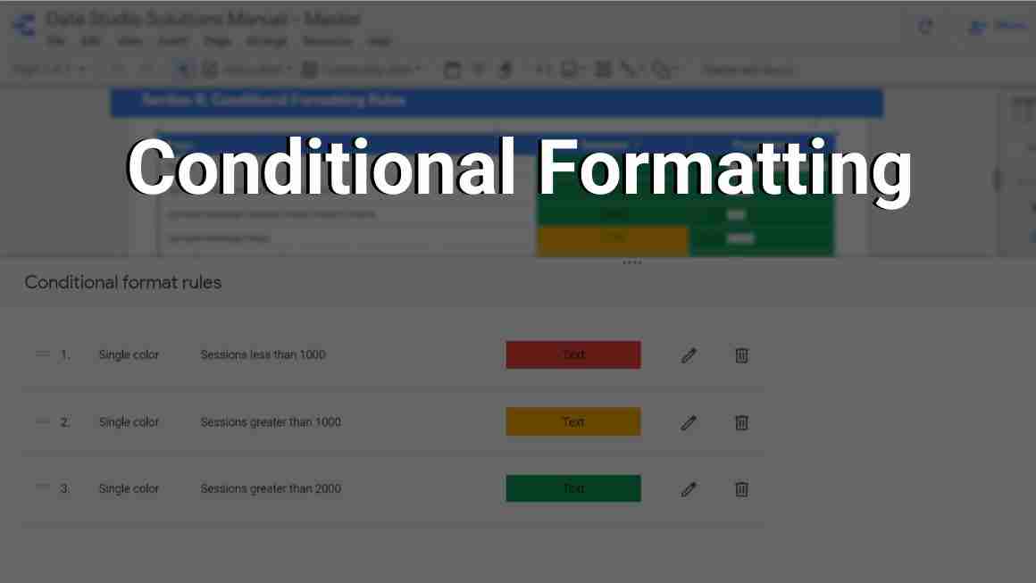
It’s simply clicking add here and the first thing that pops up is the rules. So just by looking at the data, we’re seeing sessions that are under thousand. There is a lot in the thousands and then some in the above two thousand.
So let’s create a rule that highlights the ones that are under a thousand. Colour type is already by default a single colour and the format rules, we are going to click here. If you click on sessions the condition will be less than a thousand, so thousand is an arbitrary number that we’ve picked and what we could select here, after we input the value, colour and style. have a couple of options so we could highlight the sessions, we can highlight the page cell or we can highlight the entire row.
Let’s assume for a minute that we’re going to just highlight the entire row. And as I said we can change the font colour or we could change the background. And in this case, I would like to change the background to red because under a thousand it’s not as great of performance let’s say.
We’ll change that and we’ll click save and add another and the table flashed just for a second and you can see the first value here and we’re going to expand the table, but the first value is under thousands already highlighted.
Continued…
Now we’re going to do another rule and pick all the sessions that are over two thousand. So once again sessions, select a condition greater than and we’ll put two thousand here for the entire row.
And that is a very great performance. So we’re just going to choose the green colour and save and add another. And here’s what happens we already have the red highlighted under a thousand and over two thousand graded in two thousand. It’s highlighted in green. That’s great. And then we’re going to click on sessions once again and we’re going to say perhaps the ones that are greater than a thousand are still good and we’re going to assign them just the yellow colour because those are neutrals, not that great. It’s not bad.
So somewhere in the middle, we assign that entire row again and we click save and look what happens.
The second rule actually that we created that was the green highlighting, it’s no longer valid. And the last rule that we’ve put that greater than 1000 has kind of overwritten our initial rule. So let’s see why that has happened. We can go back to conditional formatting click right here and we’ll see how the rules were written. The importance here and in a lot of different Google Products the sequence of the rules matters a lot.
So that first we have less than a thousand and that’s easy to do because it’s just a simple rule and everything that is less than a thousand will be coloured in red. However, the second rule when its session is greater than thousand it really is cancelled out by the third rule in terms of the sequence.
Continued…
So if I swapped those two, my table should correct itself. And there you go. So we have the sequence of greater than a thousand, So yes absolutely 1060 is great than 1000. But once it reaches two thousand. The green rule kicks in and we have the table formatted correctly and if I expand this table, we’ll see that all values are highlighted.
Now, we can obviously play around with how things are highlighted from a design perspective. Should we highlight only the sessions? Maybe it’s a better idea here because the page we don’t really want to highlight it. But we have the capability to do that.
I hope this was helpful! If you have any questions, feel free to DM me on LinkedIn or subscribe to my newsletter for more updates 🙂