In this post, I want to show you three different ways to create benchmarks and sales targets in Google Data Studio that can be used for your clients’ reports. We have all heard the media agency classics, “How is my campaign pacing?” or “What is the benchmark for this tactic?” and a lot of times, it is tough to say. Most of the times, it is because of platform limitations or table structure in the backend, but that is why I have put together a few techniques that you can use directly in Data Studio to answer these popular questions.
How to set up budget pacing with a bullet chart?
If you have a single metric that is of great importance, you can use a bullet chart to set a target or a benchmark. For example, if you are running a paid media campaign, you would want to know how much you are spending against your budget. Let’s say the campaign is a flash sale that spans only three days and you need to monitor budget closely.
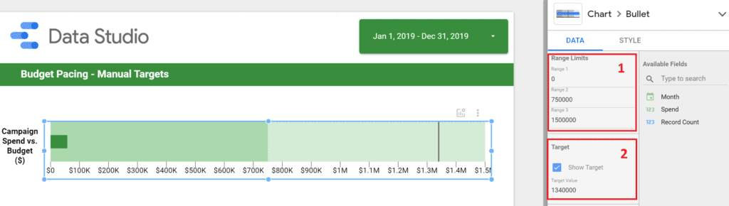
In this case, to configure a benchmark/target for your bullet chart you need to do the following:
- The first step is to set the “Range Limits”. You want to make sure Range 1 starts at 0 as an entry point. Range 2 and 3 should reflect the relative scale of your metric. If you know you are spending only $750, then you might want to set Range 2 at $500 and Range 3 at $1000. Another tip is to have Range 2 be 50% of Range 3, this creates a more visually appealing chart.
- This is the easy part. You simply pick a value for a target and check the box. The target value would appear on your chart immediately as a black line.
In addition, you can make any design changes to the coloring, axis and value rounding by navigating to “Style”.
How to add targets and benchmarks and conditional formatting to a table?
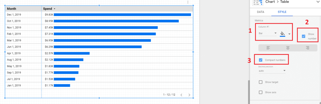
Now, you can set targets and flat benchmarks within a table as well. Unlike the bullet chart, this method is not just about a rolled-up view, but rather a more detailed representation of your data. In the scenario below, we have a “Month” dimension and a “Spend” metric. Here is how to re-create the chart:
- Switch the metric under “Column #1” to Bar. This will provide you with a more clear view of the metric’s scale.
- Tick the “Show number” box to add the value next to the bar.
- Lastly, tick the “Compact numbers” bar. If your values are in the millions, this is definitely a must. Otherwise, you might get a bit cross-eyes, when looking at large datasets.
Lastly, you can go ahead and check the “Show target” box, which will allow you to input your target/benchmark.
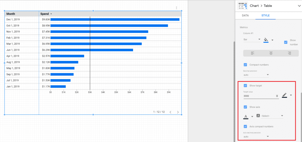
It is worth mentioning that you can repeat this process by adding additional metrics to your table (eg. impressions, clicks, CTR and etc.). The target/benchmark works on a column basis, so you can have a dedicated target/benchmark for each column.
Optional: Enhancing your targets and benchmarks with conditional formatting
As a final touch, consider using conditional formatting. If you are new to it, I have a detailed intro video/article on the topic, so you can take a look. Ideally, you would want to create a rule (#1 below) that highlights certain abnormalities in the data, which are also correlated to your targets or benchmarks.
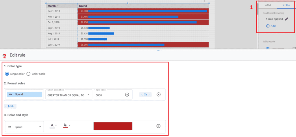
In this case (#2 above), I have my benchmark set at $5000, so by creating the conditional formatting rule, I am able to color the “Spend” fields every time they go above $5000. In this way, it would be much easier for me to find the anomalies in the data when I look at the table.
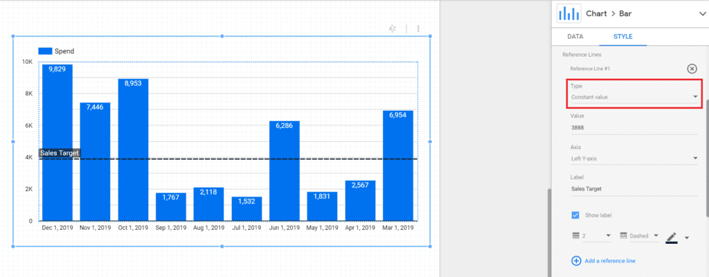
What are chart reference lines and how to use them for dynamic sales targets?
“Reference lines” are a bit more advanced than what we have seen so far and can, for example, help you visualize monthly sales or average store revenue against a specific sales target. The extra functionality here is that you can pick the target to either be a constant or a calculated value. Let’s unpack this.
Firstly, create a normal bar chart and navigate to “Style”. From there, simply select “Add a reference line” and you would get two options here:
Reference Lines with a Constant Value
Nothing new under the sun here, you can add a constant “Value” and that shows up on your bar chart. You have the ability to “Label” the reference line and formatted it, but it is fairly similar to the other methodologies we explored.
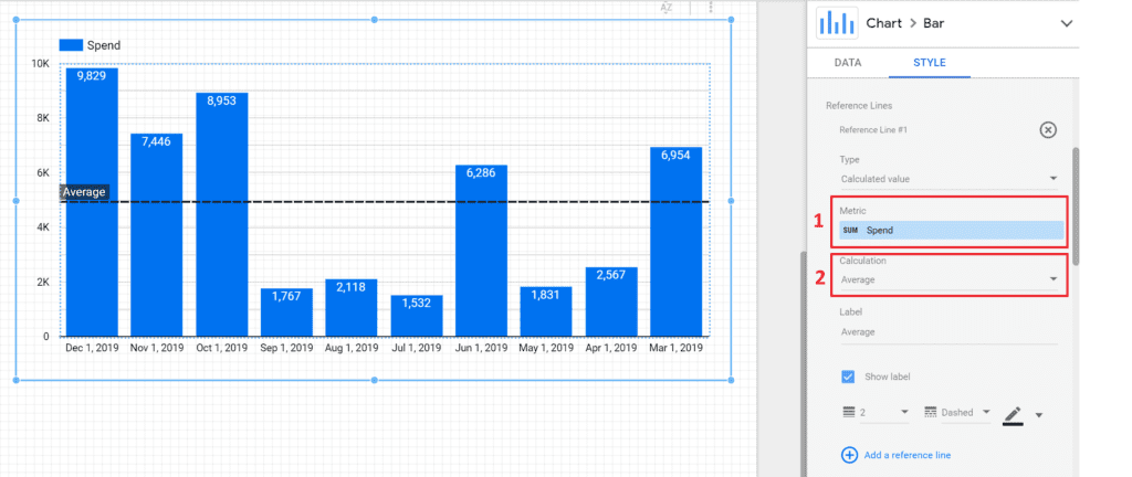
Reference Lines with a Calculated Value
This is the really cool part! If you select the “Calculated value” under “Type”, then you can create a dynamic target that changes based on a calculation. For example:
- I have picked “Spend” as my metric, which is essentially the sum of my monthly media spending.
- Then, I have selected “Average” as a calculation. Hence, every time I look at the chart and slice the data (by date, campaign and etc.), the reference line is going to fluctuate based on the average value of my “Spend” for that particular filtering. In that way, I can spot months that were below/above the average without doing any extra work.
Here is another example. You can create two reference lines and configure their calculations to the following to create a range:
- Max – This is going to display the largest value in your bar chart.
- Min – This is going to display the lowest value in your bar chart.
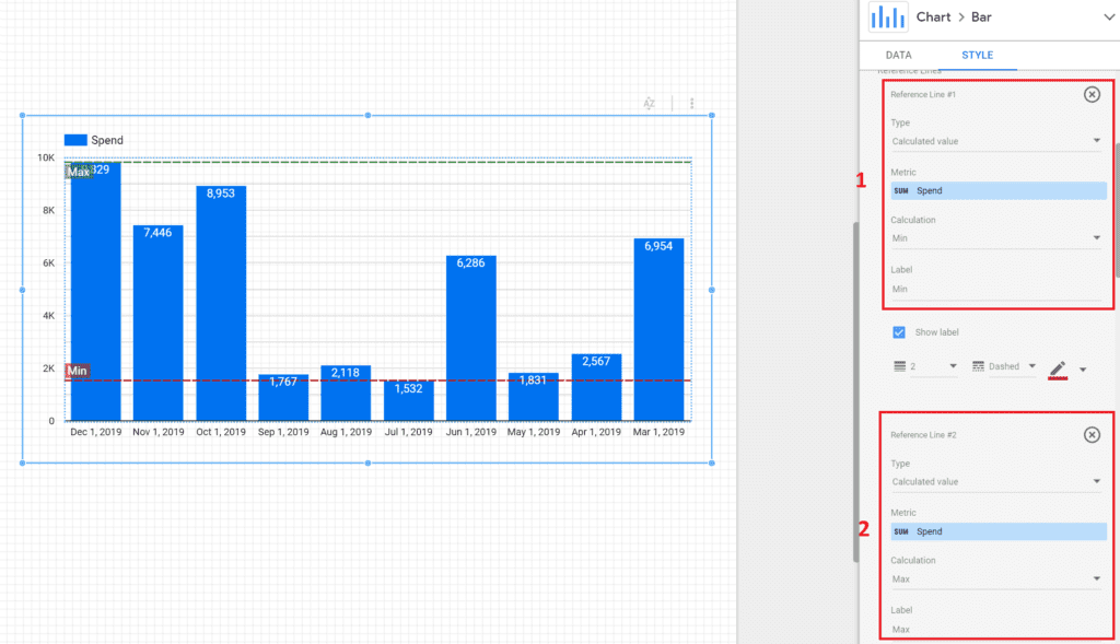
These are all great ways to create benchmarks and targets. Also, don’t forget, the “Calculation” field includes a few additional options that can be useful:
- Median
- Percentile
How to use Google BigQuery to create dynamic budget pacing tables?
This is the most advanced one from the lot, so you might find it a bit tricky. However, I want to show you how the introduction of BigQuery can make things much more flexible. In the video below (part of my course), you would be able to see how by writing a few SQL queries, you can JOIN a “Planned” and “Actual” media spend tables, which then can be transformed into a dynamic pacing chart in Data Studio. Enjoy!
I hope this was helpful! If you have any questions, feel free to DM me on LinkedIn or subscribe to my newsletter ?
Want to learn more about Google Data Studio and BigQuery?
If you want to learn how to build powerful data visualizations and further analyze marketing data with SQL take a look at my courses on Udemy. Each course includes practical hands-on exercises that will give you a chance to play around with real datasets.


2 comments
This is such a great reference for us Data Analysts… I have bookmarked this page and going to follow your guidance. Thanks for taking the time to put this together! Bravo…
Hey Souny, appreciate the kind words. Glad my article can be of help 🙂